Tricoci Salon & Spa
2023
Relevant Links:
Tricoci website ︎︎︎
Role:
Creative Direction
Note: all photography is for placement only for demonstrative purposes.
Relevant Links:
Tricoci website ︎︎︎
Role:
Creative Direction
Note: all photography is for placement only for demonstrative purposes.
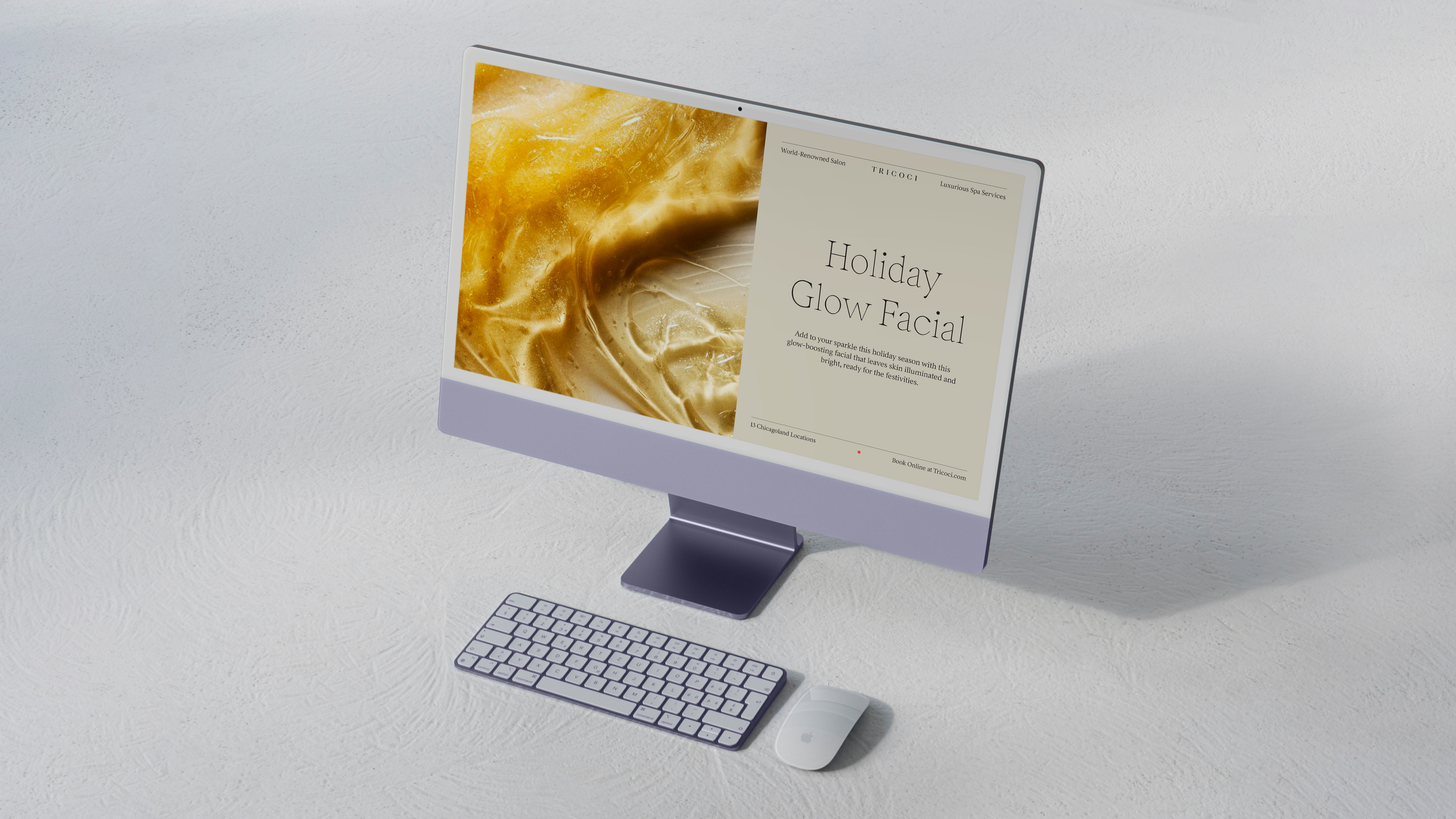
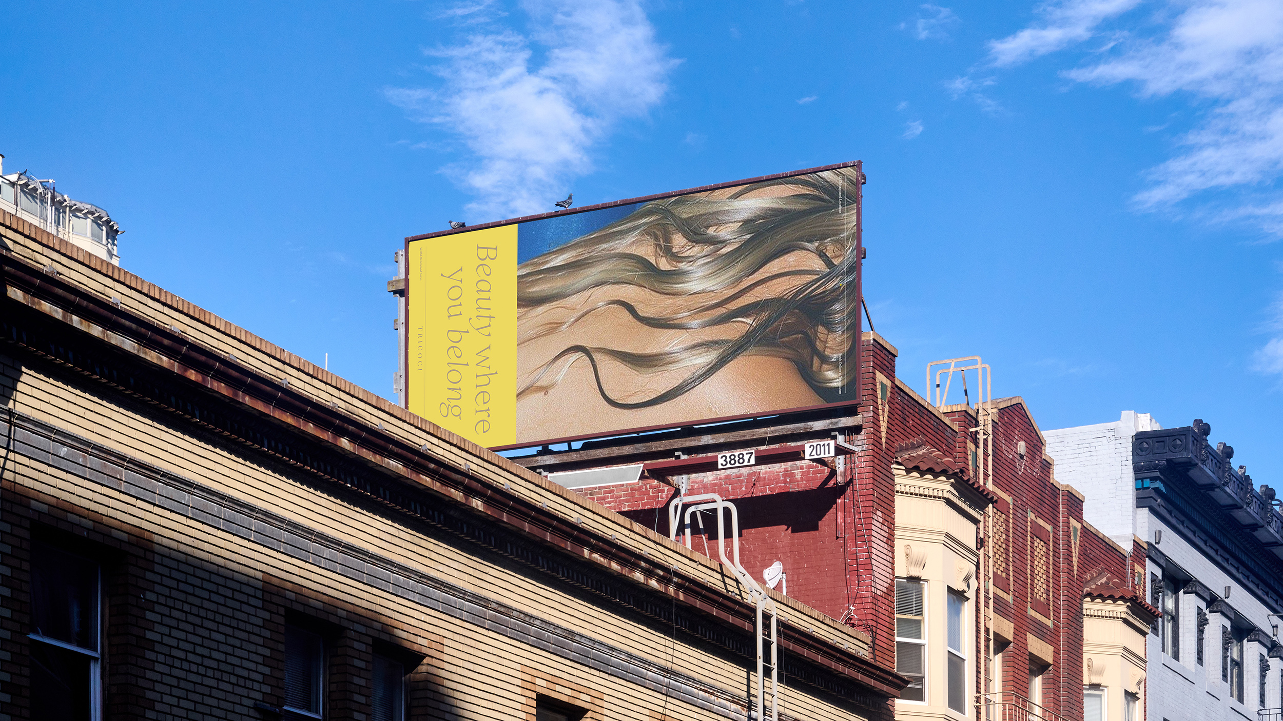
Tricoci is one of Chicagoland’s premiere salon and spa clients, with 13 locations and an over 40 year foothold. In an effort to polish their existing branding without alienating an older, faithful client base, we developed a fresh and inviting visual toolkit for Tricoci to employ and evolve as they enter the next 40 years of success.
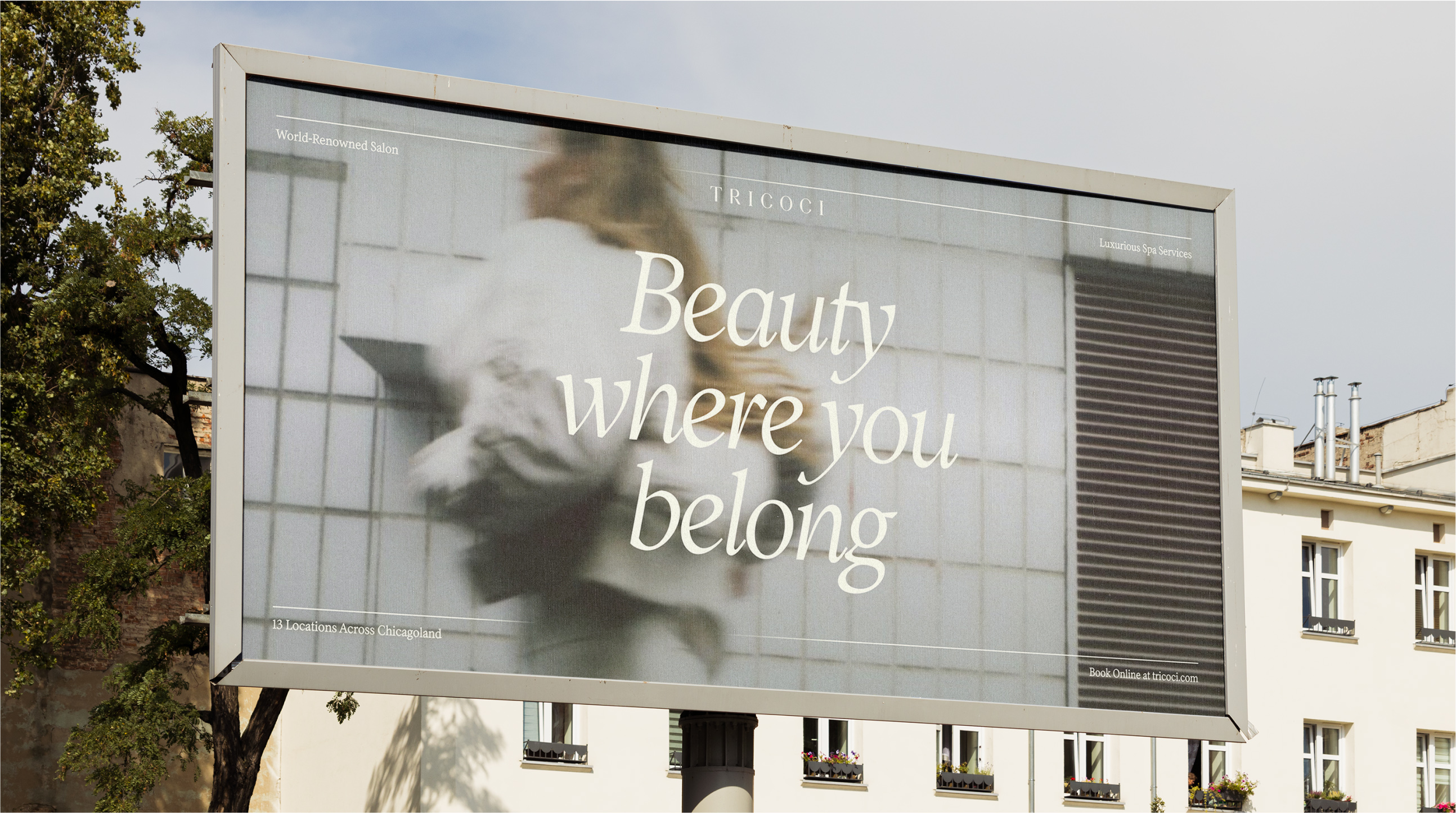
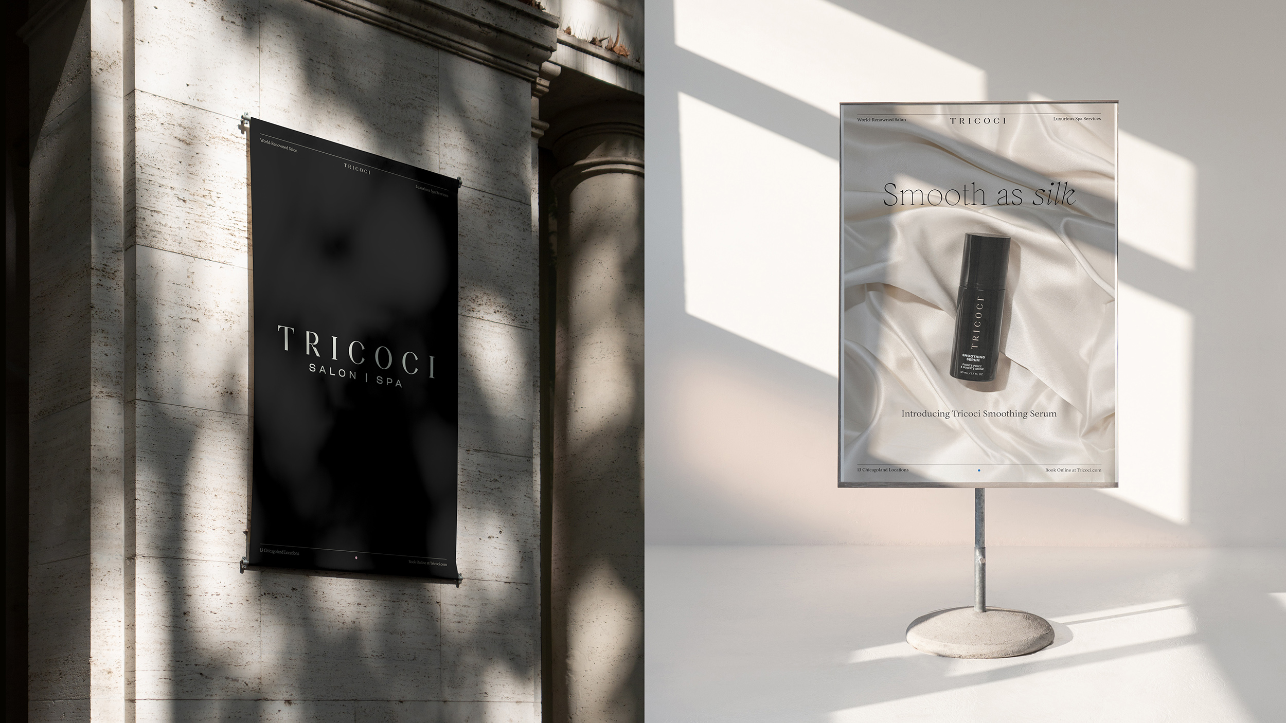
My primary objective in realizing Tricoci’s revamped creative direction was to provide a framework within which the brand could grow, rather than typical limiting brand guidelines. Using a literal frame as the brand’s recognition point, campaign photography, typography, and styling can change from season to season or from trend cycle to trend cycle. As long as key areas of note are present, the brand still remains recognizable.
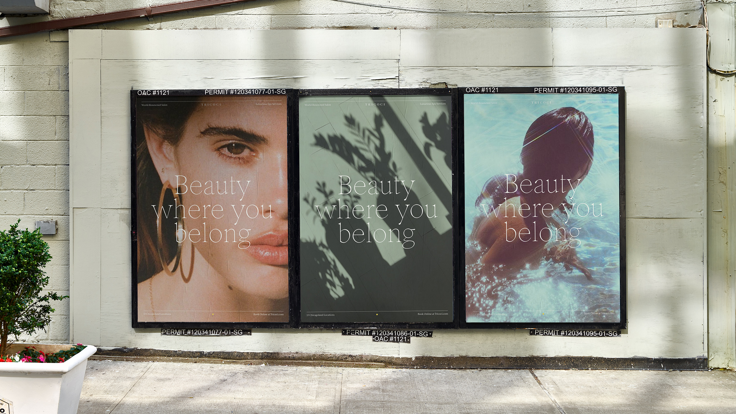
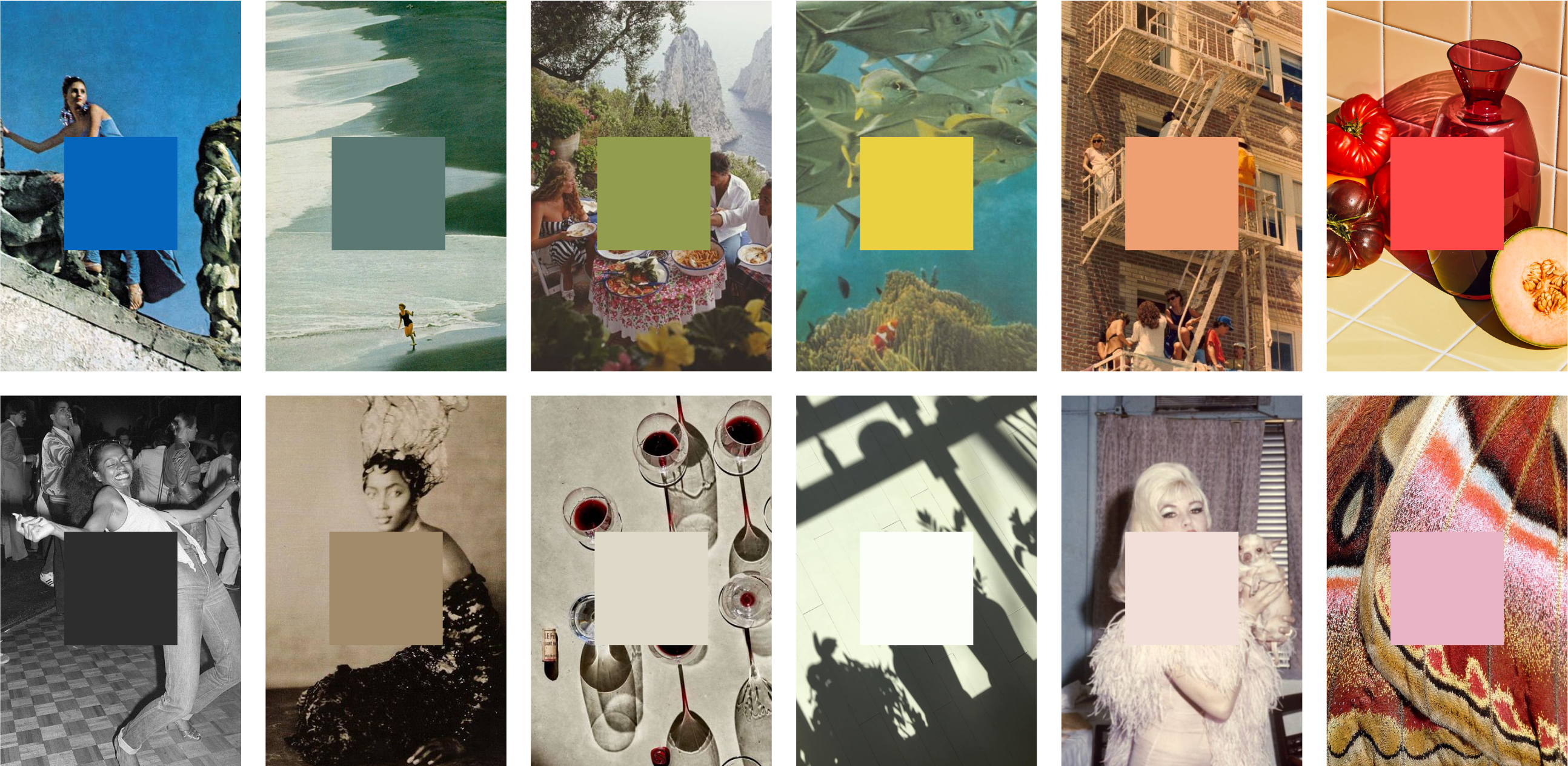
Colors were pulled from vintage vacation photography, and inital photo styles were inspired by a spectrum of the ideal to the surreal—just as the salon or spa experience nourishes the imagination and inspires. These elements were introduced as a starting point for Tricoci, with the intent that they change, evolve, and break the rules.
My primary objective in realizing Tricoci’s revamped creative direction was to provide a framework within which the brand could grow, rather than typical limiting brand guidelines. Using a literal frame as the brand’s recognition point, campaign photography, typography, and styling can change from season to season or from trend cycle to trend cycle. As long as key areas of note are present, the brand still remains recognizable.
Colors were pulled from vintage vacation photography, and inital photo styles were inspired by a spectrum of the ideal to the surreal—just as the salon or spa experience nourishes the imagination and inspires. These elements were introduced as a starting point for Tricoci, with the intent that they change, evolve, and break the rules.
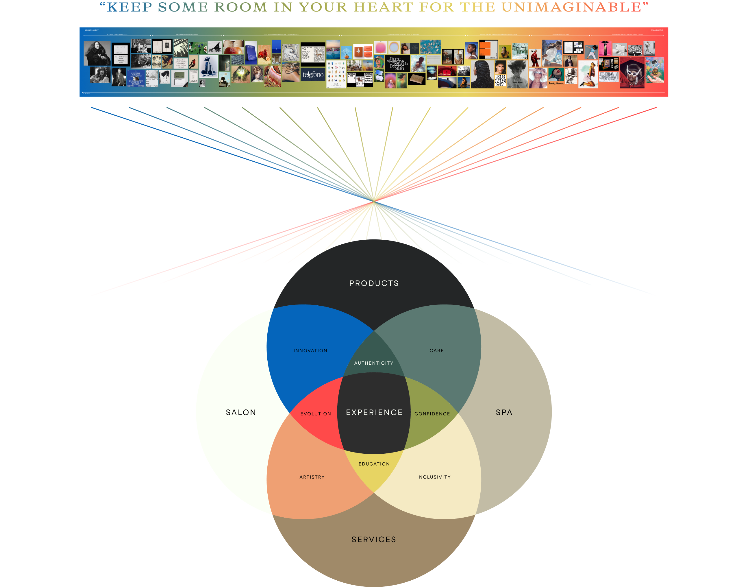
Initial moodboard (above) outlining the spectrum of salon/spa experience,
which informed the branding Euler (below). Much of my creative exploration
during discovery was inspired by the poetry of Mary Oliver.
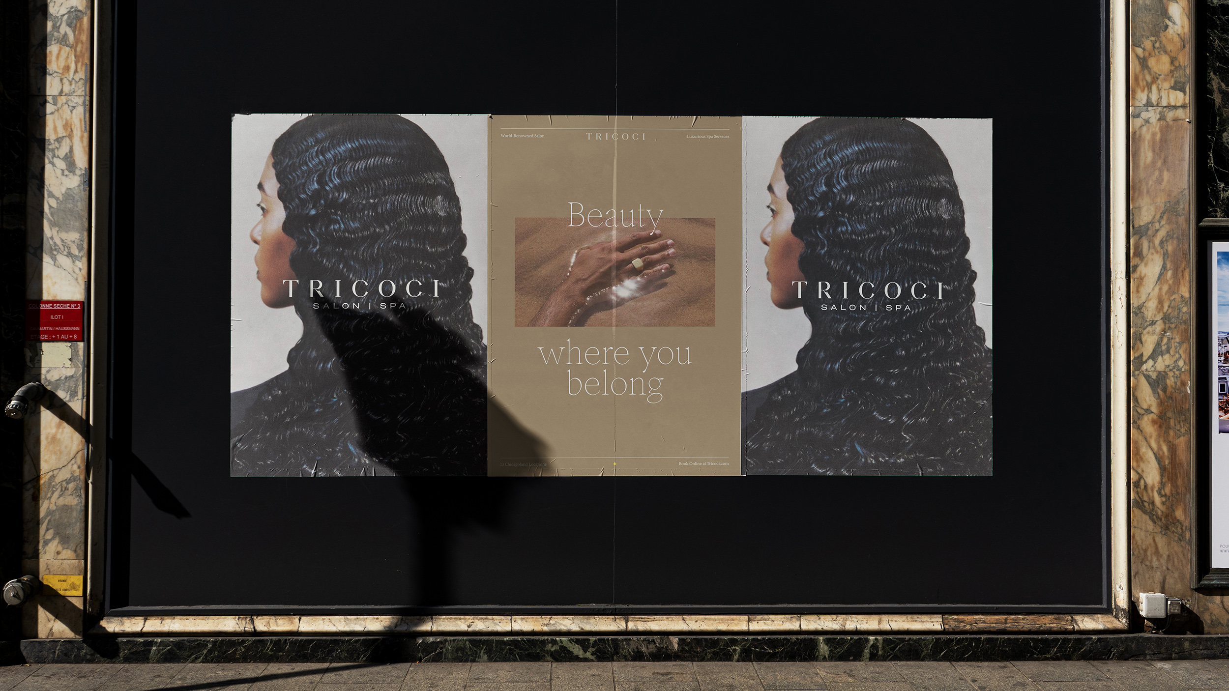
An archival Tricoci ad that inspired the notion of the ideal ︎︎︎ the surreal spectrum
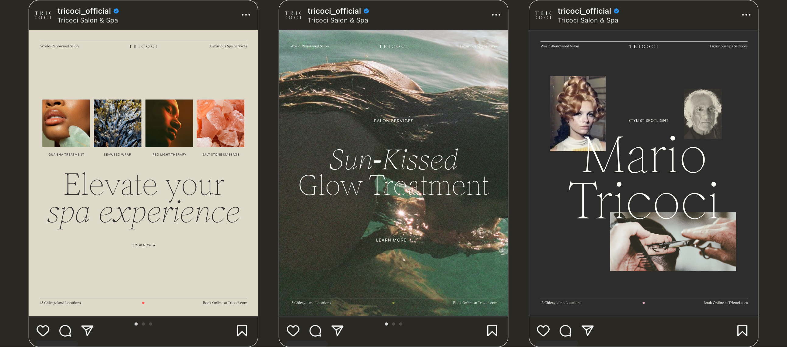
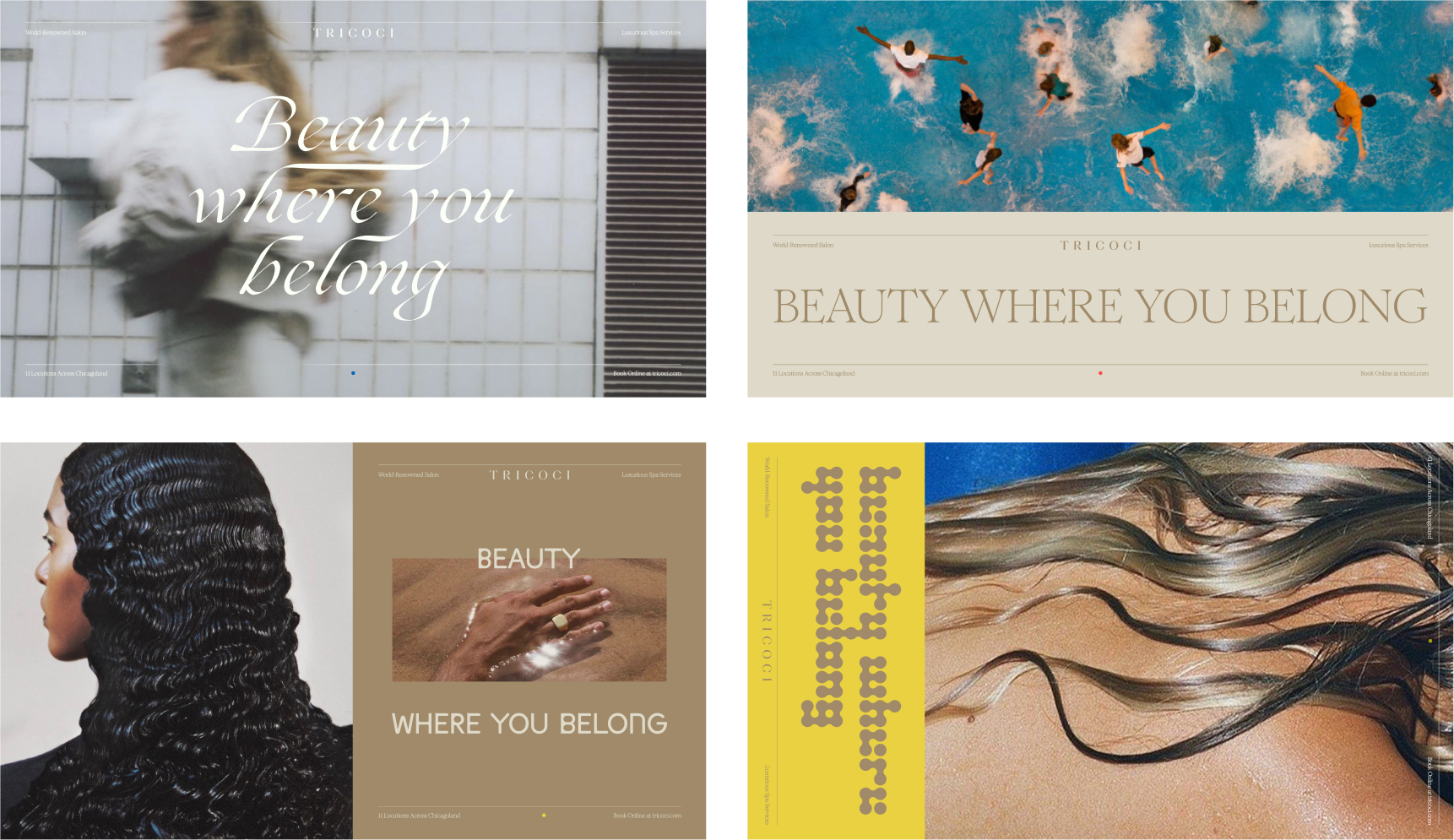
Ad styling evolution demonstration for continued brand expansion